
Artists have been recording their reactions to the landscape of the Lake District for centuries. The early tourists were so over-awed by what they saw as a terrifying vista of hills and peaks that they wouldn’t look at them directly, and used mirrors, looking over their shoulders at the reflection as it was slightly less fearsome.
The pictures they painted subsequently were over-dramatised, the fells looking Alpine in height and shape. Later artists, such as the Heaton Coopers, faced the landscape head-on and produced work which more accurately reflected the shapes of the hills. (William Heaton Cooper really did face it head on, perching on ledges on rock faces to make drawings for the climbing guides to the area.)
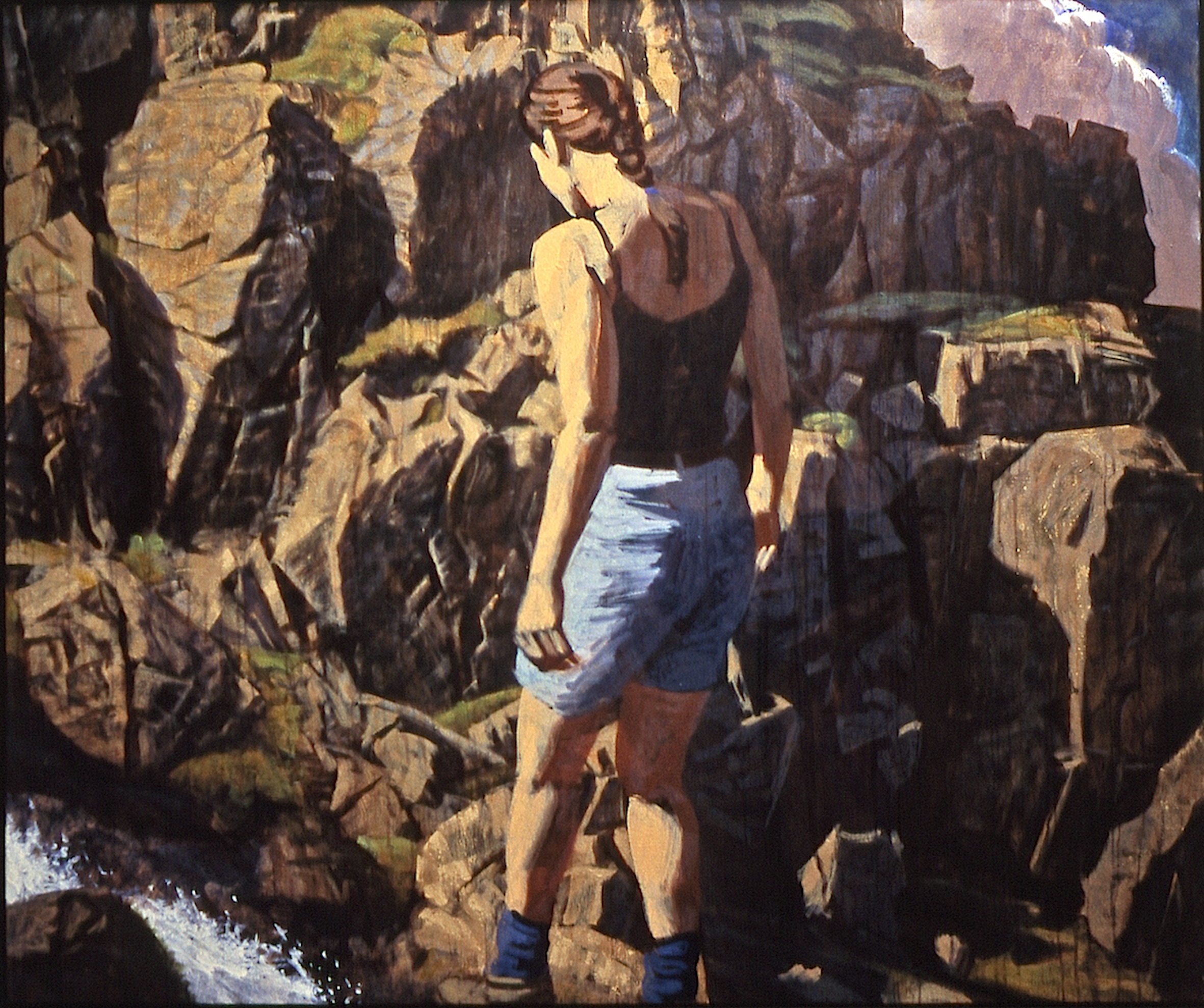
Great Gable by Julian Heaton Cooper, Britain’s leading living mountain painter
Paintings, and later photographs, of the Lakes found their way onto picture postcards sent to family and friends. There will be many armchair mountaineers who have never climbed a hill but would recognise Striding Edge from a holiday postcard. (Will they survive the new world of communication? Is the Instagram generation still going to buy and send postcards, I wonder?)
Poets, from Wordsworth onwards, found their own voices to say what the landscape of the Lake District did for them. And Alfred Wainwright, with his drawing and mapping methods, gave us his passion for the unique atmosphere and scenery of the Lakes.
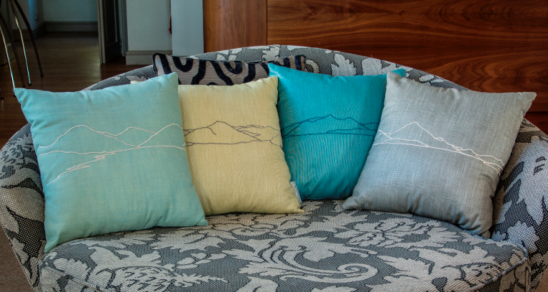
Raised in the Lake District and introduced at an early age to walking on the fells, I’ve always shared that passion. Even when I was studying and working in London, and later travelling around the world, I could still envisage the outlines of the fells. I saw them as Wainwright sketched them in his guidebooks, showing what could be seen on the horizon from the top of each hill.
Where art meets nature meets design….
I put some outlines of those fells into my own designs, notably on cushions in the Love District range. Others are doing likewise, bringing together art and the landscape of the Lakes. Windermere-based painter, Marilyn Tordoff, is a good example. She’s an artist whose landscapes decorate the walls of many hotels around the region, as well as homes throughout the country, bought by people on holiday here.
It’s important to place and frame a picture in the correct manor. A single painting can be just as powerful as a collection of paintings, if it’s allowed to breathe, with the correct space and proportion of wall around it. The mount should never be mean, giving the painting proportion and plenty of focus on the art itself.
The wall colour that it sits on could be linked with the painting and turn the whole wall into a dramatic piece of art. The frame needs to reflect the required interior styling, i.e. minimal slim aluminium which virtually recedes into the background, or wide -even ‘over-wide’ - and possibly carved, to add grandeur and texture. This doesn’t have to be old and stuffy. With a lick of coloured paints that suit the interior scheme, this can make for refreshing new take on an old favourite.